Description
Stickers are a visual way to quickly identify content in a different way than badges and labels.
Sizes
Stickers come in four sizes: sm, normal, lg, and xl. Create your own custom size with the
sticker-sizemixin.
133 133 133 133
{call ClaySticker.render}
	{param label: '133' /}
	{param size: 'sm' /}
	{param style: 'primary' /}
{/call}

{call ClaySticker.render}
	{param label: '133' /}
	{param style: 'secondary' /}
{/call}

{call ClaySticker.render}
	{param label: '133' /}
	{param size: 'lg' /}
	{param style: 'success' /}
{/call}

{call ClaySticker.render}
	{param label: '133' /}
	{param size: 'xl' /}
	{param style: 'danger' /}
{/call}<clay-sticker
label="133"
size="sm"
style="primary">
</clay-sticker>
<clay-sticker label="133" style="secondary"></clay-sticker>
<clay-sticker
label="133"
size="lg"
style="success">
</clay-sticker>
<clay-sticker
label="133"
size="xl"
style="danger">
</clay-sticker><span class="sticker sticker-primary sticker-sm">133</span>
<span class="sticker sticker-secondary">133</span>
<span class="sticker sticker-lg sticker-success">133</span>
<span class="sticker sticker-danger sticker-xl">133</span>Colors
133 133 133 133 133 133
{call ClaySticker.render}
	{param label: '133' /}
	{param style: 'primary' /}
{/call}

{call ClaySticker.render}
	{param label: '133' /}
	{param style: 'secondary' /}
{/call}

{call ClaySticker.render}
	{param label: '133' /}
	{param style: 'success' /}
{/call}

{call ClaySticker.render}
	{param label: '133' /}
	{param style: 'info' /}
{/call}

{call ClaySticker.render}
	{param label: '133' /}
	{param style: 'warning' /}
{/call}

{call ClaySticker.render}
	{param label: '133' /}
	{param style: 'danger' /}
{/call}<clay-sticker label="133"></clay-sticker>
<clay-sticker label="133" style="secondary"></clay-sticker>
<clay-sticker label="133" style="success"></clay-sticker>
<clay-sticker label="133" style="info"></clay-sticker>
<clay-sticker label="133" style="warning"></clay-sticker>
<clay-sticker label="133" style="danger"></clay-sticker><span class="sticker sticker-primary">133</span>
<span class="sticker sticker-secondary">133</span>
<span class="sticker sticker-success">133</span>
<span class="sticker sticker-info">133</span>
<span class="sticker sticker-warning">133</span>
<span class="sticker sticker-danger">133</span>Variations
Square
Use square stickers to identify files and folders. You can place up to three characters or an icon inside a square sticker. Always capitalize the text in a square sticker.
JPG
{call ClaySticker.render}
	{param label: 'JPG' /}
	{param style: 'primary' /}
{/call}

{call ClaySticker.render}
	{param icon: 'picture' /}
	{param spritemap: '/images/icons/icons.svg' /}
	{param style: 'primary' /}
{/call}<clay-sticker
label="JPG"
style="primary">
</clay-sticker>
<clay-sticker
icon="picture"
spritemap="/images/icons/icons.svg"
style="primary">
</clay-sticker><span class="sticker sticker-primary">JPG</span>
<span class="sticker sticker-primary">
<span class="inline-item">
<svg class="lexicon-icon lexicon-icon-picture" focusable="false" role="presentation">
<use href="/images/icons/icons.svg#picture" />
</svg>
</span>
</span>Round
Use a round sticker to identify people. You can place up to two characters or an image inside a round sticker. Always capitalize the text in a round sticker.
JP
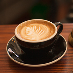
{call ClaySticker.render}
	{param label: 'JP' /}
	{param shape: 'circle' /}
	{param style: 'primary' /}
{/call}

{call ClaySticker.render}
	{param imageAlt: 'thumbnail' /}
	{param imageSrc: '/images/thumbnail_coffee.jpg' /}
	{param shape: 'circle' /}
{/call}<clay-sticker
label="JP"
style="primary"
shape="circle">
</clay-sticker>
<clay-sticker
imageAlt="thumbnail"
imageSrc="/images/thumbnail_coffee.jpg"
shape="circle">
</clay-sticker><span class="sticker sticker-primary rounded-circle">JP</span>
<span class="sticker sticker-primary rounded-circle">
<span class="sticker-overlay">
<img alt="thumbnail" class="img-fluid" src="/images/thumbnail_coffee.jpg" />
</span>
</span>Position
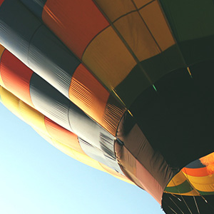
You can add a sticker to an Image Card. By default, its position is bottom left.
Use the positional sticker classes to place them anywhere relative to your container:
sticker-top-left,sticker-bottom-left,sticker-top-right, andsticker-bottom-right.
 PDF
PDF
PDF
PDF
PDF
PDF
PDF
PDF
{call ClaySticker.render}
	{param label: 'PDF' /}
	{param position: 'top-left' /}
	{param style: 'danger' /}
{/call}

{call ClaySticker.render}
	{param label: 'PDF' /}
	{param position: 'bottom-left' /}
	{param style: 'danger' /}
{/call}

{call ClaySticker.render}
	{param label: 'PDF' /}
	{param position: 'top-right' /}
	{param style: 'danger' /}
{/call}

{call ClaySticker.render}
	{param label: 'PDF' /}
	{param position: 'bottom-right' /}
	{param style: 'danger' /}
{/call}<clay-sticker
label="133"
position="top-left"
style="danger">
</clay-sticker>
<clay-sticker
label="133"
position="bottom-left"
style="danger">
</clay-sticker>
<clay-sticker
label="133"
position="top-right"
style="danger">
</clay-sticker>
<clay-sticker
label="133"
position="bottom-right"
style="danger">
</clay-sticker><div class="aspect-ratio">
<img alt="thumbnail" class="aspect-ratio-item-fluid" src="/images/thumbnail_hot_air_ballon.jpg" />
<span class="sticker sticker-danger sticker-top-left">PDF</span>
</div>
<div class="aspect-ratio">
<img alt="thumbnail" class="aspect-ratio-item-fluid" src="/images/thumbnail_hot_air_ballon.jpg" />
<span class="sticker sticker-bottom-left sticker-danger">PDF</span>
</div>
<div class="aspect-ratio">
<img alt="thumbnail" class="aspect-ratio-item-fluid" src="/images/thumbnail_hot_air_ballon.jpg" />
<span class="sticker sticker-danger sticker-top-right">PDF</span>
</div>
<div class="aspect-ratio">
<img alt="thumbnail" class="aspect-ratio-item-fluid" src="/images/thumbnail_hot_air_ballon.jpg" />
<span class="sticker sticker-bottom-right sticker-danger">PDF</span>
</div>API
| Property | Description | Type | Required | Default |
|---|---|---|---|---|
data |
Data to add to the element. | object | false | undefined |
defaultEventHandler |
Object that wires events with default listeners | object|undefined | false | undefined |
elementClasses |
CSS classes to be applied to the element. | string|undefined | false | undefined |
icon |
Render ClayIcon in the ClaySticker element. | string|undefined | false | undefined |
id |
Id to be applied to the sticker element. | string|undefined | false | undefined |
imageAlt |
Alternate text of the image. | string|undefined | false | undefined |
imageSrc |
Source of the image to be rendered inside the sticker. | string|undefined | false | undefined |
label |
Sets the text or HTML to be rendered inside sticker. | html|string|undefined | false | undefined |
outside |
Flag to indicate if the sticker should be positioned on the outside corners when position is defined. | bool | false | false |
position |
Position of the sticker in relation to the contents. Available positions are | string|undefined | false | undefined |
size |
Sticker size. Available sizes are | string|undefined | false | undefined |
shape |
Shape of the sticker. Available shapes are | string | false | rounded |
spritemap |
The path to the SVG spritemap file containing the icons. | string|undefined | false | undefined |
style |
Sticker style. Available sizes are: | string | false | primary |
title |
Title to be applied to the sticker element. | string|undefined | false | undefined |