Toggle Switch with Checkbox
<label class="toggle-switch">
	<input class="toggle-switch-check" type="checkbox" />
	<span aria-hidden="true" class="toggle-switch-bar">
		<span class="toggle-switch-handle"></span>
	</span>
</label>
Toggle Switch with Radio
<label class="toggle-switch">
	<input class="toggle-switch-check" name="toggleSwitchRadio1" type="radio" value="option1"/>
	<span aria-hidden="true" class="toggle-switch-bar">
		<span class="toggle-switch-handle"></span>
	</span>
</label>
<label class="toggle-switch">
	<input class="toggle-switch-check" name="toggleSwitchRadio1" type="radio" value="option2"/>
	<span aria-hidden="true" class="toggle-switch-bar">
		<span class="toggle-switch-handle"></span>
	</span>
</label>
<label class="toggle-switch">
	<input class="toggle-switch-check" name="toggleSwitchRadio1" type="radio" value="option3"/>
	<span aria-hidden="true" class="toggle-switch-bar">
		<span class="toggle-switch-handle"></span>
	</span>
</label>
Toggle Switch with Data Attributes
Use the data-label-on="" and data-label-off="" data attributes for the <span class="toggle-switch-handle"></span> element to display custom text when the switch is on and off.
<div class="form-group">
	<label class="toggle-switch">
		<input class="toggle-switch-check" type="checkbox" />
		<span class="toggle-switch-label">Toggle Switch with data-label-on</span>
		<span aria-hidden="true" class="toggle-switch-bar">
			<span class="toggle-switch-handle" data-label-off="" data-label-on="ON">
			</span>
		</span>
	</label>
</div>
<div class="form-group">
	<label class="toggle-switch">
		<input class="toggle-switch-check" type="checkbox" />
		<span class="toggle-switch-label">Toggle Switch with data-label on and data-label-off</span>
		<span aria-hidden="true" class="toggle-switch-bar">
			<span class="toggle-switch-handle" data-label-off="Switch is off." data-label-on="Switch is on.">
			</span>
		</span>
	</label>
</div>
Toggle Switch Text
You can display additional text with the toggle switch by adding the toggle-switch-text class to the text element. Use the toggle-switch-text-left and toggle-switch-text-right classes to position the text on the left and right side of the toggle switch, respectively.
<div class="form-group">
<label class="toggle-switch">
<input class="toggle-switch-check" type="checkbox" />
<span class="toggle-switch-label">Adding Required Text</span>
<span class="toggle-switch-text">Required *</span>
<span aria-hidden="true" class="toggle-switch-bar">
<span class="toggle-switch-handle" data-label-off="" data-label-on="ON">
</span>
</span>
</label>
</div>
<div class="form-group">
<label class="toggle-switch">
<input class="toggle-switch-check" type="checkbox" />
<span class="toggle-switch-label">Adding Required Text</span>
<span aria-hidden="true" class="toggle-switch-bar">
<span class="toggle-switch-handle" data-label-off="" data-label-on="ON">
</span>
</span>
<span class="toggle-switch-text">Required *</span>
</label>
</div>
<div class="form-group">
<label class="toggle-switch">
<input class="toggle-switch-check" type="checkbox" />
<span class="toggle-switch-label">Required Text on Right</span>
<span aria-hidden="true" class="toggle-switch-bar">
<span class="toggle-switch-handle" data-label-off="" data-label-on="ON">
</span>
</span>
<span class="toggle-switch-text toggle-switch-text-right">Required *</span>
</label>
</div>
<div class="form-group">
<label class="toggle-switch">
<input class="toggle-switch-check" type="checkbox" />
<span class="toggle-switch-label">Required Text on Left</span>
<span class="toggle-switch-text toggle-switch-text-left">Required *</span>
<span aria-hidden="true" class="toggle-switch-bar">
<span class="toggle-switch-handle" data-label-off="" data-label-on="ON">
</span>
</span>
</label>
</div>
<div class="form-group">
<label class="toggle-switch">
<input class="toggle-switch-check" type="checkbox" />
<span class="toggle-switch-label">The Kitchen Sink</span>
<span class="toggle-switch-text">Top Text</span>
<span class="toggle-switch-text toggle-switch-text-left">Error</span>
<span aria-hidden="true" class="toggle-switch-bar">
<span class="toggle-switch-handle" data-label-off="OFF" data-label-on="ON">
</span>
</span>
<span class="toggle-switch-text toggle-switch-text-right">Required *</span>
<span class="toggle-switch-text">Bottom Text</span>
</label>
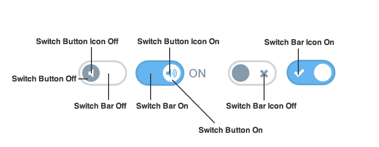
</div>Toggle Switches with Icons
Add <span class="button-icon button-icon-on icon-volume-up toggle-switch-icon"></span> to add an icon to the switch for the on position.
Add <span class="button-icon button-icon-off icon-volume-off toggle-switch-icon"></span> to add an icon to the switch for the off position.
<div class="form-group">
	<label class="toggle-switch">
		<input class="toggle-switch-check" type="checkbox" />
		<span aria-hidden="true" class="toggle-switch-bar">
			<span class="toggle-switch-handle" data-label-off="" data-label-on="">
				<span class="button-icon button-icon-on toggle-switch-icon">
					<svg class="lexicon-icon lexicon-icon-unlock" focusable="false" role="presentation">
						<use href="/images/icons/icons.svg#unlock" />
					</svg>
				</span>
				<span class="button-icon button-icon-off toggle-switch-icon">
					<svg class="lexicon-icon lexicon-icon-lock" focusable="false" role="presentation">
						<use href="/images/icons/icons.svg#lock" />
					</svg>
				</span>
			</span>
		</span>
	</label>
</div>
<div class="form-group">
	<label class="toggle-switch">
		<input class="toggle-switch-check" type="checkbox" />
		<span class="toggle-switch-label">Toggle Switch with data-label-on</span>
		<span aria-hidden="true" class="toggle-switch-bar">
			<span class="toggle-switch-handle" data-label-off="" data-label-on="LIVE">
				<span class="button-icon button-icon-on toggle-switch-icon">
					<svg class="lexicon-icon lexicon-icon-live" focusable="false" role="presentation">
						<use href="/images/icons/icons.svg#live" />
					</svg>
				</span>
				<span class="button-icon button-icon-off toggle-switch-icon">
					<svg class="lexicon-icon lexicon-icon-staging" focusable="false" role="presentation">
						<use href="/images/icons/icons.svg#staging" />
					</svg>
				</span>
			</span>
		</span>
	</label>
</div>
<div class="form-group">
	<label class="toggle-switch">
		<input class="toggle-switch-check" type="checkbox" />
		<span class="toggle-switch-label">Toggle Switch with data-label on and data-label-off</span>
		<span aria-hidden="true" class="toggle-switch-bar">
			<span class="toggle-switch-handle" data-label-off="Product Menu Closed" data-label-on="Product Menu Open">
				<span class="button-icon button-icon-on toggle-switch-icon">
					<svg class="lexicon-icon lexicon-icon-product-menu-open" focusable="false" role="presentation">
						<use href="/images/icons/icons.svg#product-menu-open" />
					</svg>
				</span>
				<span class="button-icon button-icon-off toggle-switch-icon">
					<svg class="lexicon-icon lexicon-icon-product-menu-closed" focusable="false" role="presentation">
						<use href="/images/icons/icons.svg#product-menu-closed" />
					</svg>
				</span>
			</span>
		</span>
	</label>
</div>
Toggle Switches with Icons (Alternate)
Alternatively, you can add <span class="icon-ok toggle-switch-icon toggle-switch-icon-on"></span> to add an icon to the switch for the on position.
Alternatively, you can add <span class="icon-remove toggle-switch-icon toggle-switch-icon-off"></span> to add an icon to the switch for the off position.
<div class="form-group">
	<label class="toggle-switch">
		<input class="toggle-switch-check" type="checkbox" />
		<span aria-hidden="true" class="toggle-switch-bar">
			<span class="toggle-switch-handle">
				<span class="toggle-switch-icon toggle-switch-icon-on">
					<svg class="lexicon-icon lexicon-icon-check" focusable="false" role="presentation">
						<use href="/images/icons/icons.svg#check" />
					</svg>
				</span>
				<span class="toggle-switch-icon toggle-switch-icon-off">
					<svg class="lexicon-icon lexicon-icon-times" focusable="false" role="presentation">
						<use href="/images/icons/icons.svg#times" />
					</svg>
				</span>
			</span>
		</span>
	</label>
</div>
Disabled Toggle Switches
To disable a toggle-switch, add the disabled attribute to <input type="checkbox">.
<div class="form-group">
	<label class="toggle-switch">
		<input class="toggle-switch-check" disabled="" type="checkbox"/>
		<span aria-hidden="true" class="toggle-switch-bar">
			<span class="toggle-switch-handle" data-label-off="" data-label-on="">
				<span class="button-icon button-icon-on toggle-switch-icon">
					<svg class="lexicon-icon lexicon-icon-unlock" focusable="false" role="presentation">
						<use href="/images/icons/icons.svg#unlock" />
					</svg>
				</span>
				<span class="button-icon button-icon-off toggle-switch-icon">
					<svg class="lexicon-icon lexicon-icon-lock" focusable="false" role="presentation">
						<use href="/images/icons/icons.svg#lock" />
					</svg>
				</span>
			</span>
		</span>
	</label>
</div>
<div class="form-group">
	<label class="disabled toggle-switch">
		<input class="toggle-switch-check" disabled="" type="checkbox"/>
		<span class="toggle-switch-label">Toggle Switch with data-label-on</span>
		<span aria-hidden="true" class="toggle-switch-bar">
			<span class="toggle-switch-handle" data-label-off="" data-label-on="LIVE">
				<span class="button-icon button-icon-on toggle-switch-icon">
					<svg class="lexicon-icon lexicon-icon-live" focusable="false" role="presentation">
						<use href="/images/icons/icons.svg#live" />
					</svg>
				</span>
				<span class="button-icon button-icon-off toggle-switch-icon">
					<svg class="lexicon-icon lexicon-icon-staging" focusable="false" role="presentation">
						<use href="/images/icons/icons.svg#staging" />
					</svg>
				</span>
			</span>
		</span>
	</label>
</div>
<div class="form-group">
	<label class="toggle-switch">
		<input checked="" class="toggle-switch-check" disabled="" type="checkbox"/>
		<span aria-hidden="true" class="toggle-switch-bar">
			<span class="toggle-switch-handle" data-label-off="Product Menu Closed" data-label-on="Product Menu Open">
				<span class="button-icon button-icon-on toggle-switch-icon">
					<svg class="lexicon-icon lexicon-icon-product-menu-open" focusable="false" role="presentation">
						<use href="/images/icons/icons.svg#product-menu-open" />
					</svg>
				</span>
				<span class="button-icon button-icon-off toggle-switch-icon">
					<svg class="lexicon-icon lexicon-icon-product-menu-closed" focusable="false" role="presentation">
						<use href="/images/icons/icons.svg#product-menu-closed" />
					</svg>
				</span>
			</span>
		</span>
	</label>
</div>
Extending Toggles
This section explains how to customize toggles. Use at your own risk.
Custom Toggle Switch using Images
Customize the toggle-switch button in the off position with .toggle-switch-check:empty ~ .toggle-switch-bar:after {}.
Customize the toggle-switch button icon in the off position with .toggle-switch-check:empty ~ .toggle-switch-bar .toggle-switch-icon.button-icon {}.
Customize the toggle-switch bar in the off position with .toggle-switch-check:empty ~ .toggle-switch-bar:before {}.
Customize the toggle-switch bar icon in the off position with .toggle-switch-check:empty ~ .toggle-switch-bar .toggle-switch-icon-off {}.
Customize the toggle-switch button in the on position with .toggle-switch-check:checked ~ .toggle-switch-bar:after {}.
Customize the toggle-switch button icon in the on position with .toggle-switch-check:checked ~ .toggle-switch-bar .toggle-switch-icon.button-icon.
Customize the toggle-switch bar in the on position with .toggle-switch-check:checked ~ .toggle-switch-bar:before {}.
Customize the toggle-switch bar icon in the on position with .toggle-switch-check:checked ~ .toggle-switch-bar .toggle-switch-icon-on {}.
<style>
	#demoToggleSwitch .toggle-switch-check:empty ~ .toggle-switch-bar:after {
		background-color: transparent;
		background-image: url(/images/switch_button.png);
		background-repeat: no-repeat;
		background-size: 100%;
		border-width: 0;
		bottom: 0;
		height: auto;
		left: 2px;
		top: 1px;
		width: 22px;
	}

	#demoToggleSwitch .toggle-switch-check:empty ~ .toggle-switch-bar:before {
		background-color: transparent;
		background-image: url(/images/switch_base.png);
		background-repeat: no-repeat;
		background-size: 100%;
		border-radius: 20px;
		border-width: 0;
		width: 51px;
	}

	#demoToggleSwitch .toggle-switch-check:empty ~ .toggle-switch-bar .toggle-switch-icon-off {
		background-image: url(/images/switch_off_icon.png);
		background-repeat: no-repeat;
		background-size: 100%;
		height: 15px;
		left: 28px;
		top: 4px;
		width: 15px;
	}

	#demoToggleSwitch .toggle-switch-check:checked ~ .toggle-switch-bar:after {
		left: 26px;
	}

	#demoToggleSwitch .toggle-switch-check:checked ~ .toggle-switch-bar .toggle-switch-icon-on {
		background-image: url(/images/switch_on_icon.png);
		background-repeat: no-repeat;
		background-size: 100%;
		height: 17px;
		left: 5px;
		top: 4px;
		width: 17px;
	}

	@media (min-width: 768px) {
		#demoToggleSwitch .toggle-switch-check:empty ~ .toggle-switch-bar:after {
			width: 30px;
		}

		#demoToggleSwitch .toggle-switch-check:empty ~ .toggle-switch-bar:before {
			width: 68px;
		}

		#demoToggleSwitch .toggle-switch-check:empty ~ .toggle-switch-bar .toggle-switch-icon-off {
			height: 17px;
			left: 40px;
			top: 7px;
			width: 17px;
		}

		#demoToggleSwitch .toggle-switch-check:checked ~ .toggle-switch-bar:after {
			left: 35px;
		}

		#demoToggleSwitch .toggle-switch-check:checked ~ .toggle-switch-bar .toggle-switch-icon-on {
			left: 12px;
			top: 8px;
		}
	}
</style>

<div class="form-group" id="demoToggleSwitch" style="margin-bottom:0;">
	<label class="toggle-switch">
		<input class="toggle-switch-check" type="checkbox" />
		<span aria-hidden="true" class="toggle-switch-bar">
			<span class="toggle-switch-handle">
					<span class="toggle-switch-icon toggle-switch-icon-on"></span>
					<span class="toggle-switch-icon toggle-switch-icon-off"></span>
			</span>
		</span>
	</label>
</div>
iOS Style Toggle Switches
<div class="form-group ios-toggle-switch" style="margin-bottom:0;">
	<label class="toggle-switch">
		<input class="toggle-switch-check" type="checkbox" />
		<span aria-hidden="true" class="toggle-switch-bar">
			<span class="toggle-switch-handle">
			</span>
		</span>
	</label>
	<label class="toggle-switch">
		<input class="toggle-switch-check" type="checkbox" />
		<span aria-hidden="true" class="toggle-switch-bar">
			<span class="toggle-switch-handle">
				<span class="toggle-switch-icon toggle-switch-icon-on">|</span>
				<span class="icon-circle-blank toggle-switch-icon toggle-switch-icon-off"></span>
			</span>
		</span>
	</label>
</div>